

Rob from redwood photography shares some of the band promo pics that have caught his eye during this week’s travels on the worldly wise web…
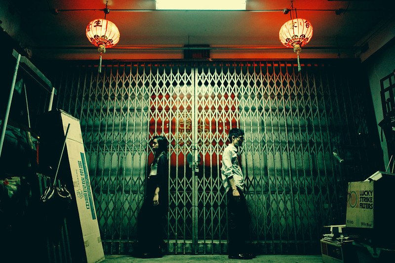
Image number one comes from one of my fave photographers that I follow on flickr. Jon Siegel, an American photographer currently based in Singapore, creates fantastic street photography. All his images have a cinematic storytelling feel to them with a ‘cool’ tone in the shadows. Being a fan of Jon’s work, I was stoked when I saw he’d posted some promo images for a band called ‘Bored Spies’.
I really like this image…it has texture created by the shutters, symmetry around the lights and positioning of the subjects, the green cast mixed with the red glow of the lights looks really cool (‘cos red and green are complementary colours, don’t ya know..), and the subjects facing away from each other creates a nice tension.
It’s a great ‘arty’ image that would work well as album artwork.
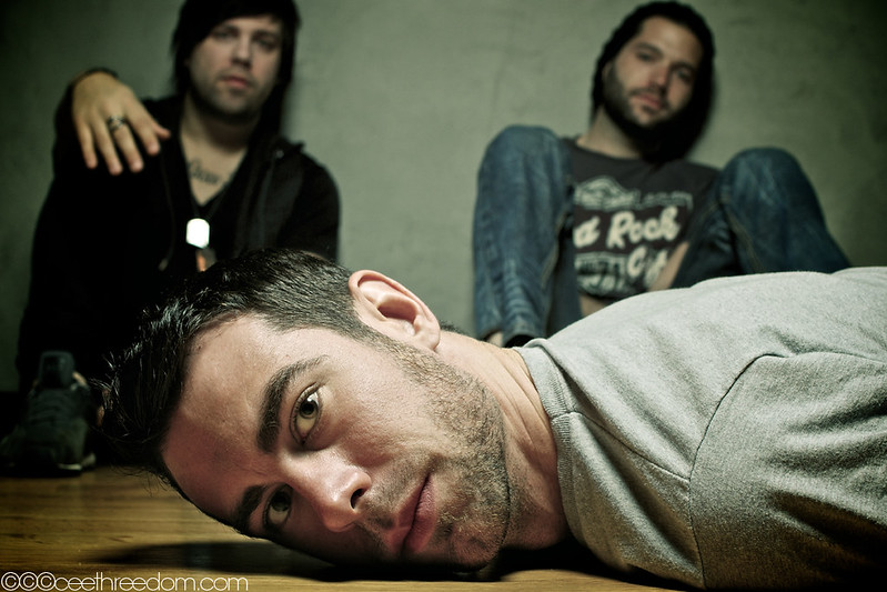
Next up is a image of ‘The Chuck Shaffer Pitcure Show‘, a US rock band based on the East coast. Again it leapt out at me, and shows how a simple bit of creativity can make for a really compelling image. The photograph is from an LA artist called ceethreedom, and I think it’s an awesome capture.
A trio image with the front-man in sharp focus, and the other two band members dropped out of focus using depth of field, is a common (but nonetheless effective) format for band photos. By experimenting with the composition, along with some nice lighting to create shadows (notice the flash catchlight in the subjects eye?), ceethreedom has really smashed it with this one. Great work.
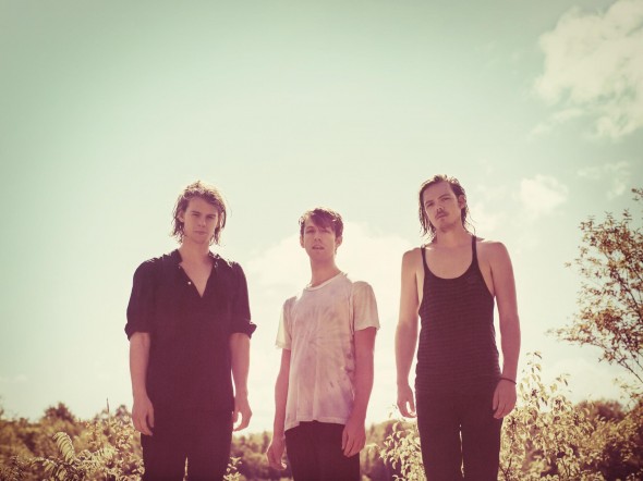
This weeks final example is a band that have just featured as Right Chord Music’s ‘Band of the Week’. Half Moon Run were called out by RCM for their complex mix styles and fantastic vocals, but it was the band image that stood out for me. I think it’s by a Canadian photographer called John Londono, who’s well known in Montreal for his commercial and music photography.
It’s a fairly simply image…but for me there are three things that really make it work. Firstly, it’s backlit (the photographer has positioned them so he’s shooting into the sun) which is creating that nice summery edge light around the hair.
Second is the space he’s allowed at the top of the frame. Traditional photographic theory suggests that subjects shouldn’t be placed along the centre of the image…it’s more interesting to move them away from the centre (you might have heard of the ‘rule of thirds’ – it creates tension). But I see a lot of great photographers completely ignoring this rule. In this example, the expanse of sky is fundamental to making this image work.
(By the way, also notice how the photographer is shooting from below the band’s eye-line…he was probably sitting or squatting down when he took the shot. Again this makes the image more interesting because it’s not a normal perspective, plus it emphasises the sky).
Finally the image has had some really nice vintage film processing. Whilst you can’t rely too much on post-processing to make your images work, shifting the colours and contrast to create a subtly different visual experience can make a good photo great. In this case the processing works with the image really well.
Ok that’s it! I hope this has given you some ideas and inspiration for your own band photos. Remember, very often folks will see your images before they hear your music, so your images need to be the same standard as your songwriting!
And if you’d rather focus on looking ‘uber-cool’ and let someone else worry about the technicalities of getting the shot right, then feel free to get in touch.
‘Til next time….
Rob.
Hey! – if you have band images that you’re proud of, then tweet the URL to @redwoodphotos and you might feature right here on the RCM blog!


